Empowering college students to efficiently find available study spaces while encouraging the use of campus resources.
Bearly Study 📚
Duration: 10/22 - 12/22
Tools: Figma, Photoshop
Discipline: UX/UI, Mobile App
Context
Bearly Study is a mobile app concept that I designed as a solo passion project with the goal of ideating solutions for a currently unpleasant experience at UC Berkeley (go bears!) — the renowned difficulty in finding suitable areas to study/work on campus with adequate open seating.
This led to my initial problem statement to tackle:
👉 How might we help students seamlessly tailor study spaces on campus to their personal needs?
↳ compilation of Reddit posts by students at Berkeley, expressing frustrations and asking other students for advice on best study spots, availabilities/utilities, exploring locations, and more
Research Summary
I was able to survey students at Berkeley and interview 5 of those surveyed students (ages ranged 18-25) to learn more about their experiences when looking for an ideal study space.
What are the students’ experiences with campus study spaces?
Some insights were:
Features of an “ideal study space” differs across situations and preferences of each student, and being able to find a space that suits their situational needs (such as a place to quietly solo study for exams or a place to quickly work in between classes) is a top priority
Trying to find open seats at well-known areas is nearly impossible during busy hours
New students are more inclined to explore new spaces, but continuous unpleasant experiences with wasting time trying to find open seats in unfamiliar areas discourages future attempts
The Problem
The excitement of finding new study spaces and working on campus is lost in the midst of the common issues of wasting time trying to find available seating and resources.
Spending more time trying to find a place to work than actually working...
What are students currently using to work around this problem?
MARKET RESEARCH


Google Maps
lib.berkeley.edu
↳ doesn’t always show the features like availability or resources of a location that students are looking for
↳ website that students have to dig through to see an overview of what resources are available to them
Synthesis
Students are more likely to prioritize certain study features over others based on their situational needs.
Meet Jennie! 💌
USER PERSONA
Based on my researched user groups, I created a persona to define one of my end users.
JOURNEY MAP
Finding pain points & areas of opportunity.
Coupling Jennie’s persona, I also mapped out her process of a time she would be looking for a study space on campus to visualize areas I could improve.
REDEFINING THE SCOPE
Expansion of my original problem statement.
How might we help students seamlessly tailor study spaces on campus to their personal needs?
→ How might we make it easier to access available spaces that match the students’ needs?
→. How might we encourage students to use campus study spaces and resources?
Ideation
Looking at how students had currently been working around the problem, the existing services seemed to lack a prioritization of satisfying the students’ needs at Berkeley. Therefore, rather than ideating features of an existing app/product, I decided to converge on the idea of developing a mobile app concept — a mobile app rather than other mediums due to its quick access while on the go.
Brainstorming use cases of the app concept.
MODIFIED CRAZY 8’S
AFFINITY MAPPING
Information display & efficiency.
After storyboarding scenarios of use cases, I ideated app features through affinity mapping and grouping in order to prioritize tools based on students’ needs.
USER FLOW DIAGRAMS
Taking the features that were previously highlighted, I mapped out the flows that users would go through to reach their goals of exploring and finding study spaces.


Project Goals:
1. Discoverability
→ present a range of suitable spaces to explore
2. Clarity
→ information should be easily and quickly comprehensible
3. Accessibility
→ highlight accessible features and resources available
Wireframes & Selected Iterations
* click on the following images to take a closer look!
During my design process, I realized that I could go on FOREVER coming up with various ways I could present information.
While exploring designs for the first-contact component of the app (quick view list of the study spaces), I decided to prioritize showing study space features and seating availability over other aspects like photos or distance -- ultimately going with #7.
Final Concept 🐻🤳
Prototype
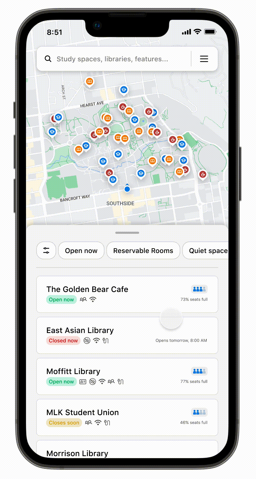
quick filtering
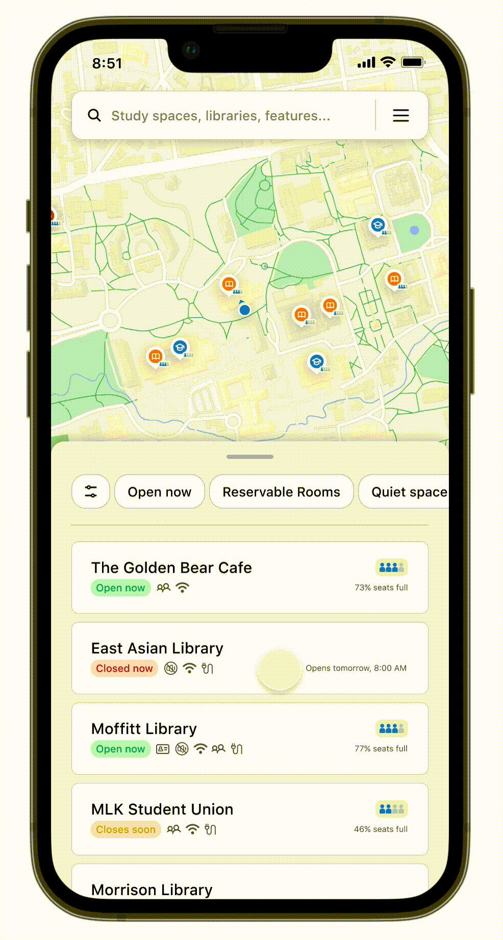
crowdsourcing flow
Learnings & Takeaways
📣 My Learnings
I initially thought that scrapping my work and changing designs meant that I wasn’t doing well, but when I look back at my work, I believe it was the best part of the process. Gaining new insights/ideas allowed me to reevaluate my design decisions and either validate them or create iterations that align closer to user needs.
Rather than being worried, I believe this experience will allow me to be more excited to find new user insights and confidently use design thinking to implement changes in future projects.
🔁 Future Iterations
With more time, I would definitely be interested in further testing my design iterations, as well as exploring the technical side of this app concept. With an app that uses location-based tech, accuracy is also crucial to the whole user experience. If the user encounters false information: finding no seats available in a study space when the app says the place is only half full, the user would be discouraged from treating the product as a trustable solution later on.