Redesigning & developing a responsive website for a Riot Games sponsored gaming club at UC Berkeley
Berkeley Legends
Duration
2/22 - 5/22
Tools
Figma, Visual Studio Code
My Role
UX Designer
Team
Team Leads — Davina, Jake
Designers — Evaline, Diya, Bee
Developers — Jennifer, Sean, Jared, Cynthia
Discipline
Website Design
Project Summary
What is Berkeley Legends?
Berkeley Legends (now known as Riot Games at Berkeley) is a competitive and casual gaming club at UC Berkeley. While they used to mainly play one game (League of Legends), they wanted to now highlight that they welcome all who play or have an interest in any of the games made by Riot.
Deliverables
My team at Innovative Design redesigned their website and delivered the final UI screens to reflect the overall club branding changes, as well as to improve the website’s UX — optimizing the flow for new members to join.
My Contributions
As a designer, my tasks included synthesizing research insights, leading feedback sessions with Berkeley Legends, and iterating through user flows of the final designs/interactions. I worked with Diya and Bee who focused on the art assets and graphics throughout the site pages.
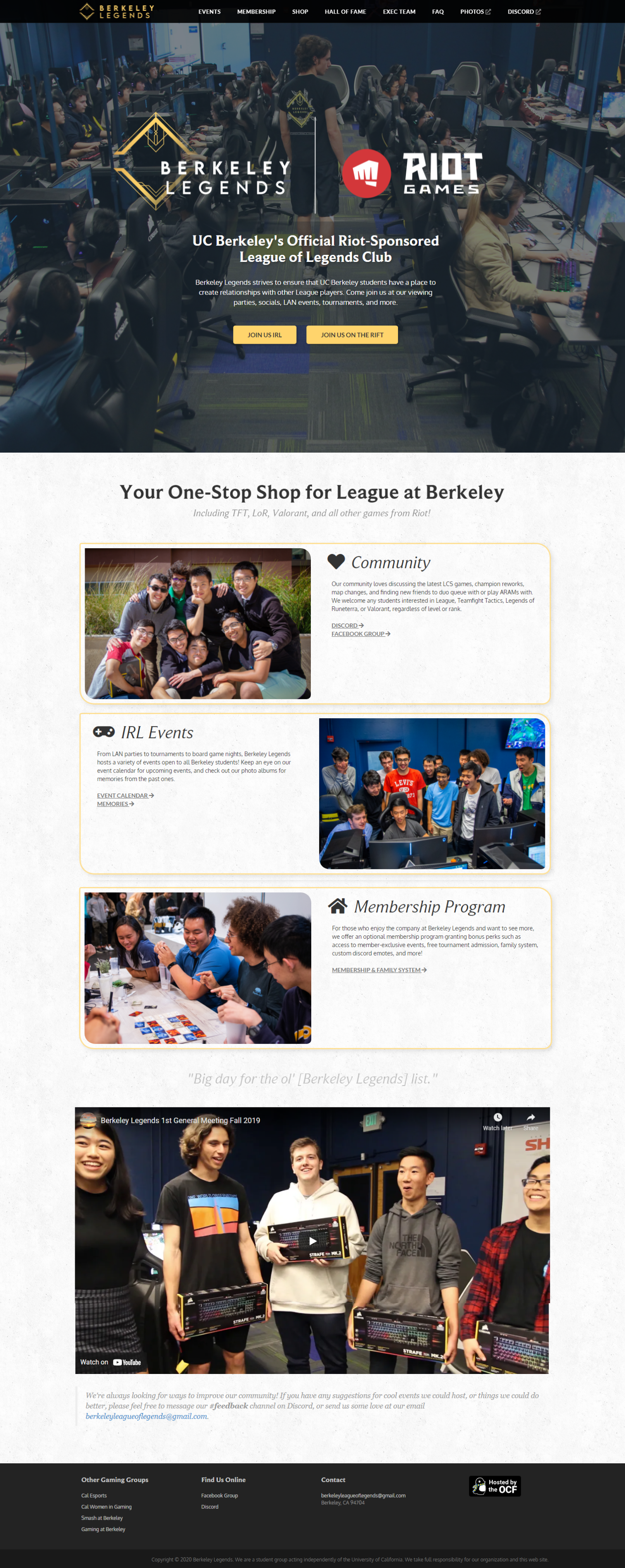
Old Design
New Design

Research
We went through the existing website pages and flows with students who would be interested in the club, as well as current members. Most users expressed difficulty with finding how to join while others found that the UI was inconsistent, potentially making them reconsider even looking further into the website.
Current site exploration.
DESIGN AUDIT & USER TESTING
After interviewing current members and representatives from Berkeley Legends, we found that the existing website had incomplete pages and was confusing to navigate for those who were unfamiliar with the organization.
With the redesign, we sought to facilitate the flow of initial discovery of Berkeley Legends, improve the user interface, and focus on optimizing their member conversion rate from the website.
What did we want to accomplish?
PROJECT GOALS

We wanted to ensure that the new website accurately reflects the club’s rebranding and facilitates the process of gaining new members.
Client Goal

Our main focus was for new users to seamlessly find what they’re looking for about the club with more clarity on membership requirements and events.
User Goal
Synthesis
Based on interview responses and the club’s target audience, I created two user personas that represent different archetypes which guided our ideation process.
Defining our user groups.
USER PERSONAS

* Robin was our primary persona to focus on building the experience for since we noted that those who are already interested in joining, like Andrea, might be more motivated to dig through the website than someone who was simply curious and undecided about joining.
Ideation
While thinking about our goals and user pain points with the previous design, we reorganized the pages of the website based on information groupings which created a more natural flow.
What to keep, change, or add.
INFORMATION ARCHITECTURE

I then created mid-fidelity wireframes and followed up with our previous interviewees to test.
After looking through the About page, users almost always clicked on either the Exec board button at the bottom of the page or scrolled up to select FAQs for remaining unanswered questions about the club. In order to facilitate the ease of navigating the website, we removed the FAQ page from the navigation bar and added it as an extension at the end of the About page for quicker access, similar to the Exec Board page.
Mapping out the flows.
WIREFRAMING / USER TESTING
We also reordered the navigation bar menu with the greatest to least important action items, such as having an introduction to the club and its activities at the beginning while the shop page is at the end.
Navigation bar
previous navigation bar

new navigation bar

Iteration & Development
My team proceeded to designing high-fidelity screens through referencing their official club rebranding, as well as their social media graphics (shown on the right). We also established a more definitive and stylistic summary for the new website through moodboarding (left).
Style guide + moodboarding.
VISUAL INSPIRATION
ITERATIONS
With the home page, we focused on designing a brief overview of the club while using the primary colors from the style/rebrand guide to highlight call-to-action items in each section. These would lead the user to their goals faster than having to first shift through the pages with only the navigation bar.
Home page iterations.

1. mid-fi wireframe
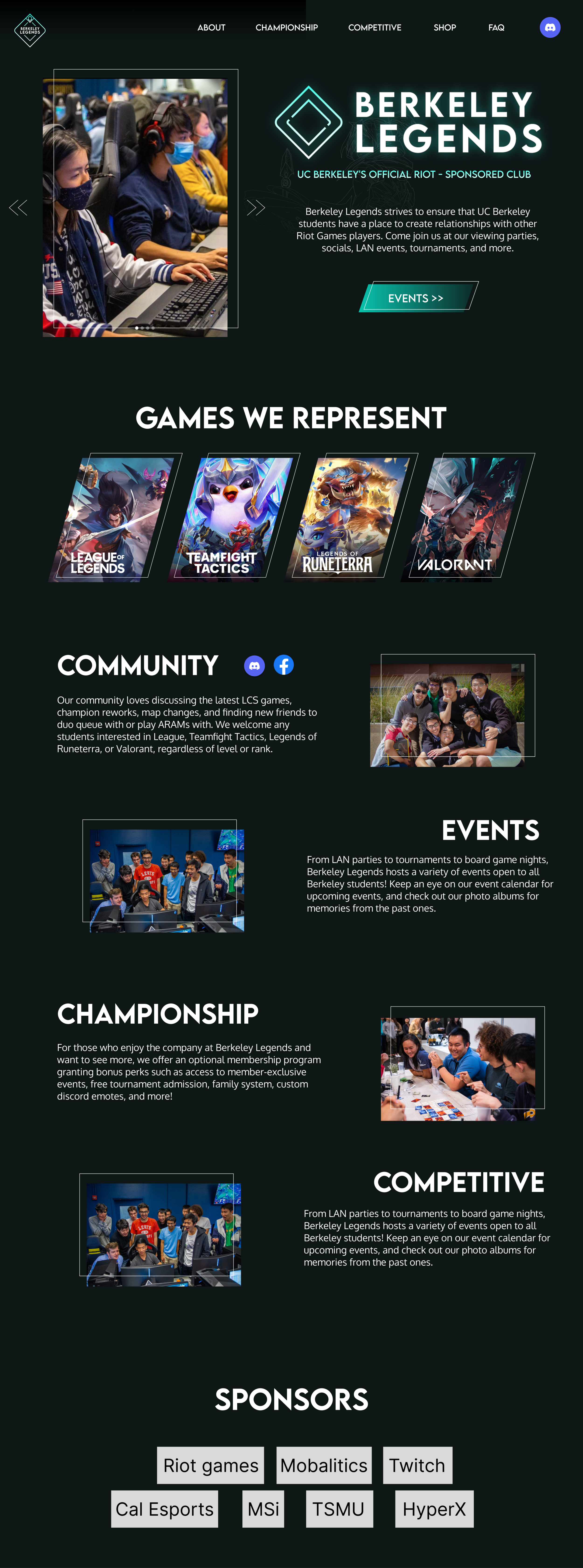
2. bare-bone visuals

3. clarity & action items
ITERATIONS
After communicating with our developers, we received feedback from the team that implementing a more interaction-heavy design or using typical shop APIs were going to be difficult to finish, so we made design tradeoffs while working with development constraints and feasibility.
Shop page iterations.
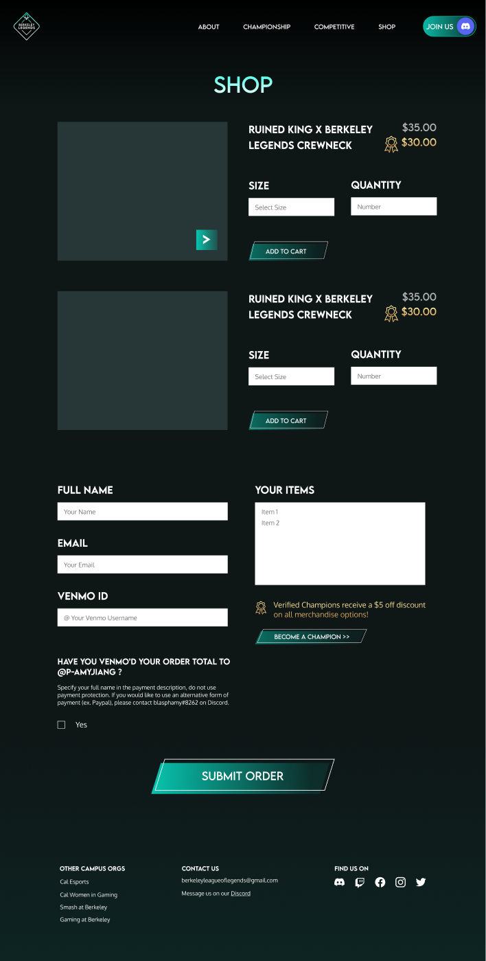
our initial proposal

developers’ idea

final compromise
Final Screens


Home Page

About Page

Championship Page
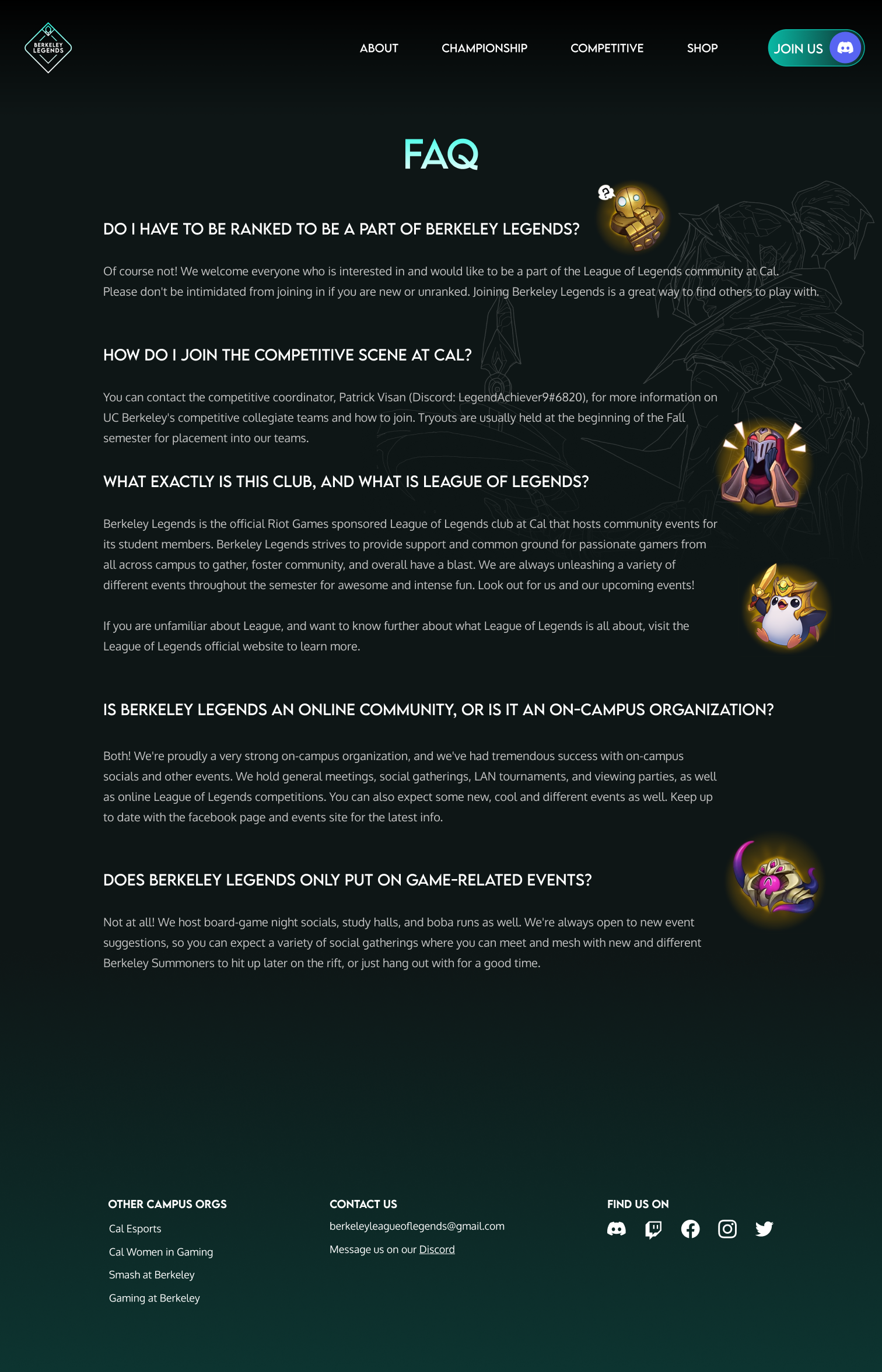
FAQ Page
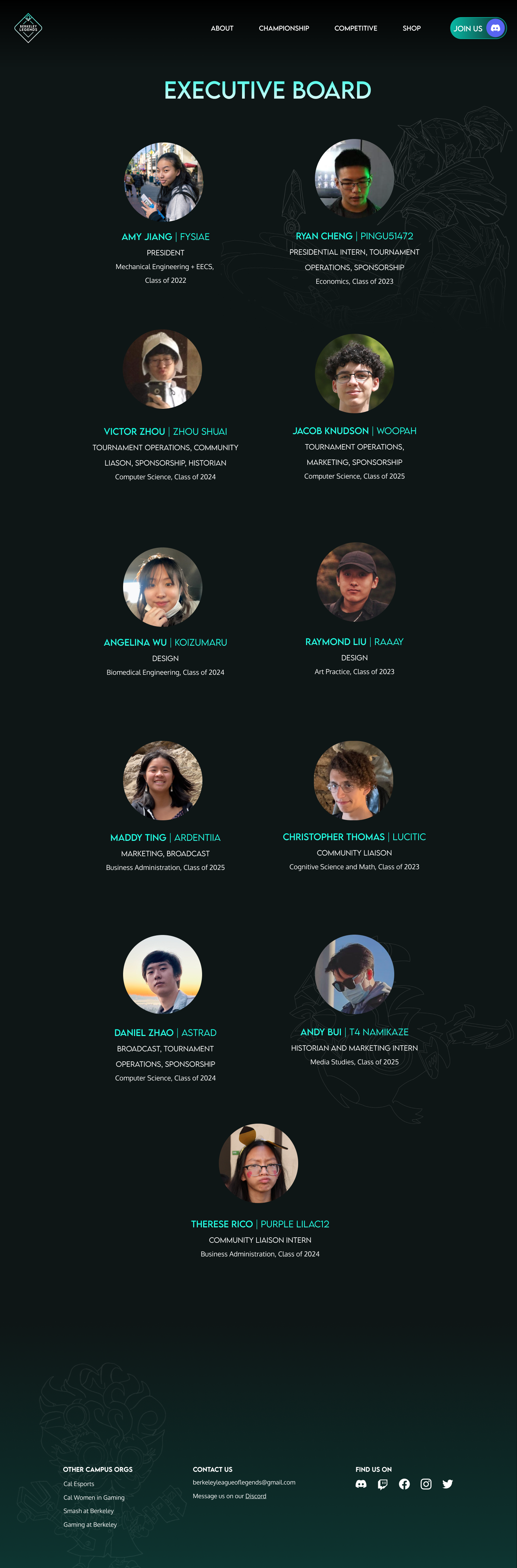
Exec Board Page
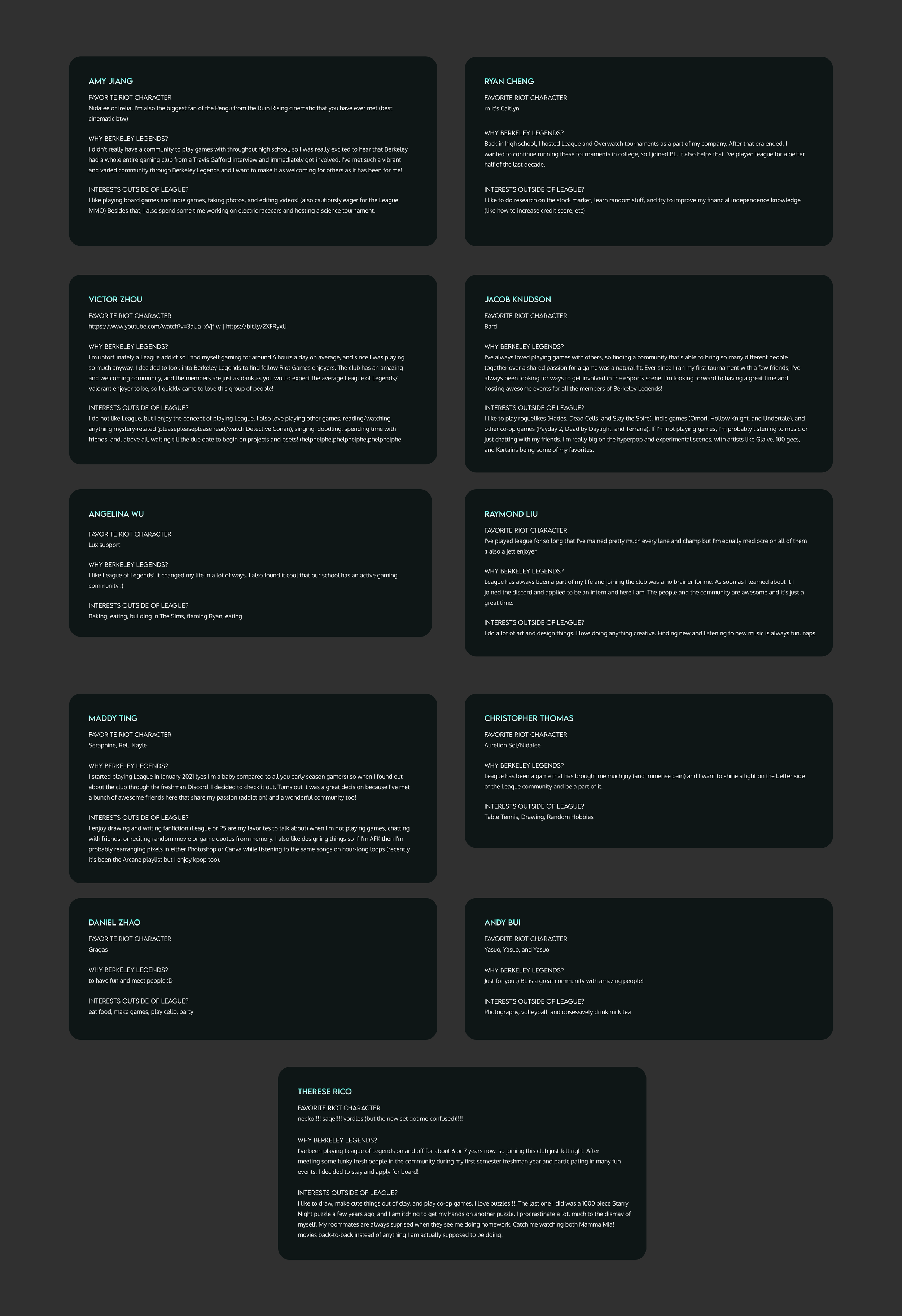
Exec Board Page - Hover Overlays

Shop Page (no items)
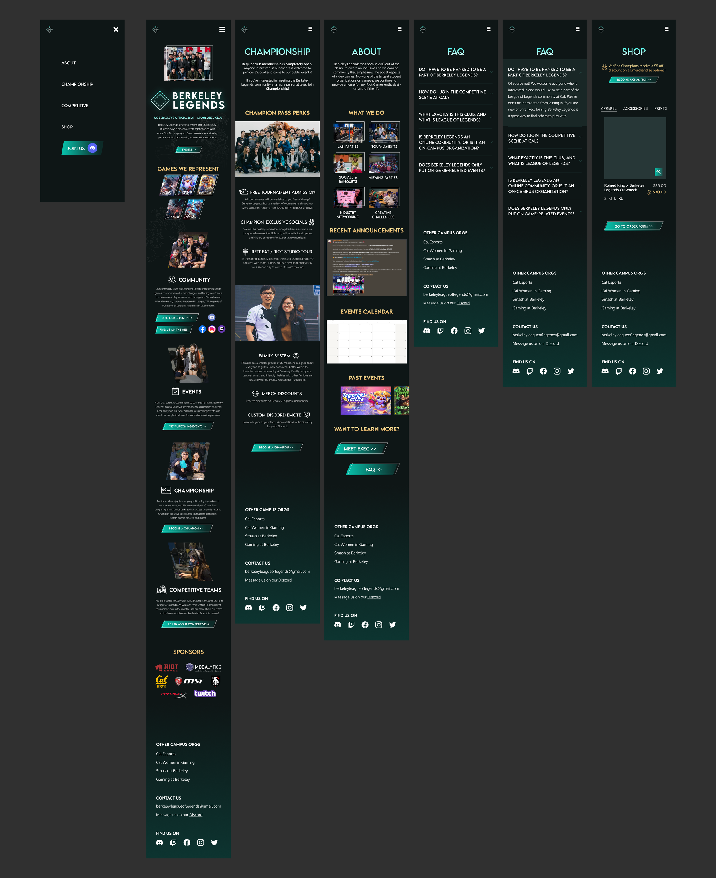
Mobile Screens
Reflection & Learnings

I’m so thankful for this opportunity and all the friends I made while working on this project! I learned so much about how a digital product really comes to life and about communicating with a team outside of design.
Introduce my designs early.
Even a “finished design” always has improvements/changes that can be made, and letting the team in early on any of my designs makes the iteration process smoother.
Understanding the Constraints.
Working with a cross-functional team gave light on how important the voices of each person on the team are when making decisions about the progression of the project. Making design decisions involves much more than just a relationship between me and a user, but also stakeholder negotiation/priorities, development constraints, and more.