Berkeley Legends
→ complete website redesign for a competitive gaming club
MY ROLE
Web/UX Designer
TEAM
Davina, Jake (Team Leads)
Bee, Diya, & me! (Design)
Jennifer, Sean, Jared, Cynthia (Development)

DURATION
3 months
TOOLS
Figma, Visual Studio Code — HTML, CSS, Javascript
DELIVERABLES
Website (Desktop & Mobile Views)
INTRO
Rebrand = Redesign.
Berkeley Legends is a competitive and beginner friendly gaming club at UC Berkeley, officially sponsored by Riot Games, Twitch, MSI, HyperX, and more.
Following a rebranding of their club, Berkeley Legends requested from my team at Innovative Design to design and fully develop a new website to reflect the branding changes, as well as improve the website UX, catering to those who are new to their club.
01 DISCOVER
Breakdown of the current experience.
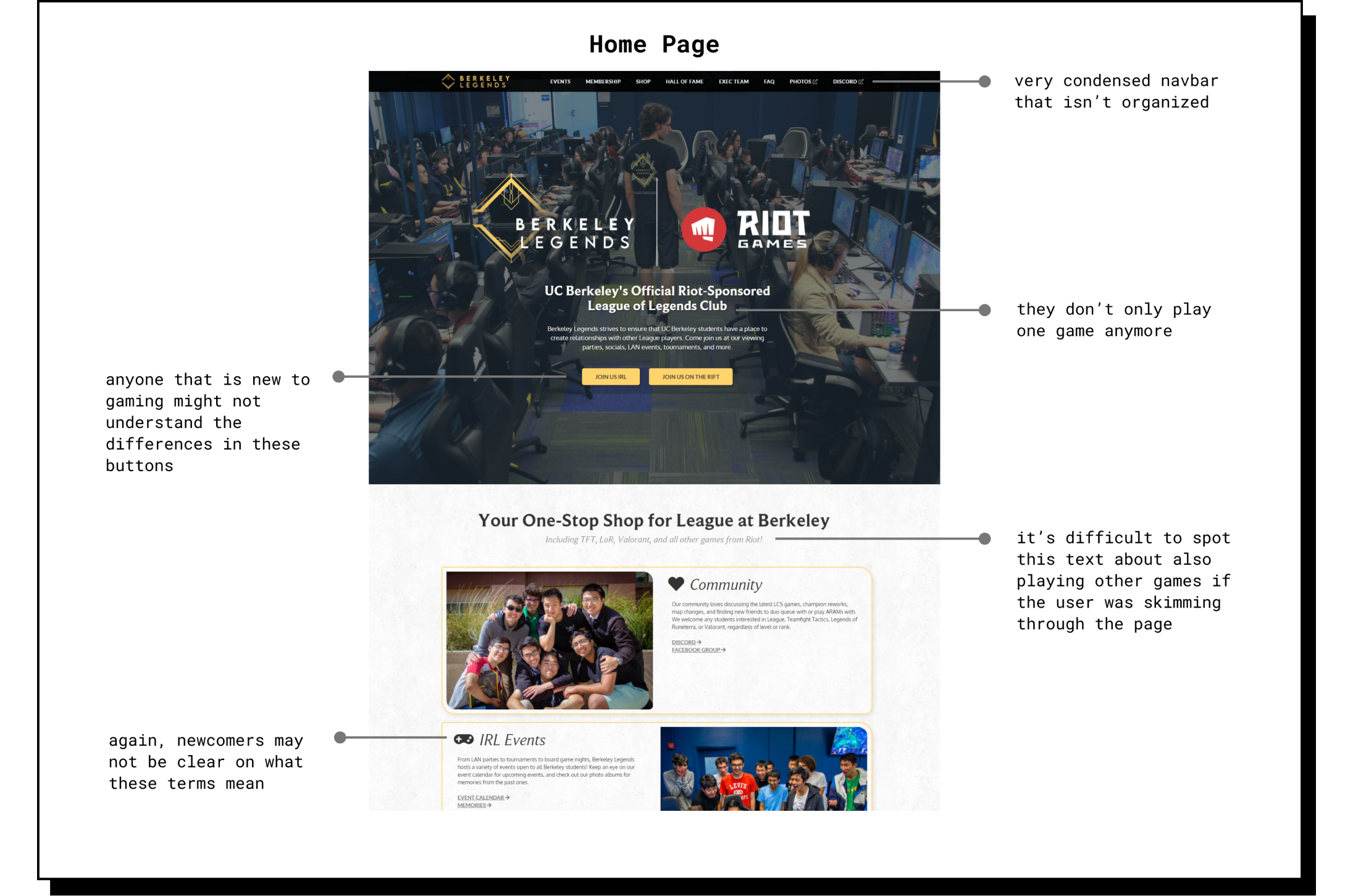
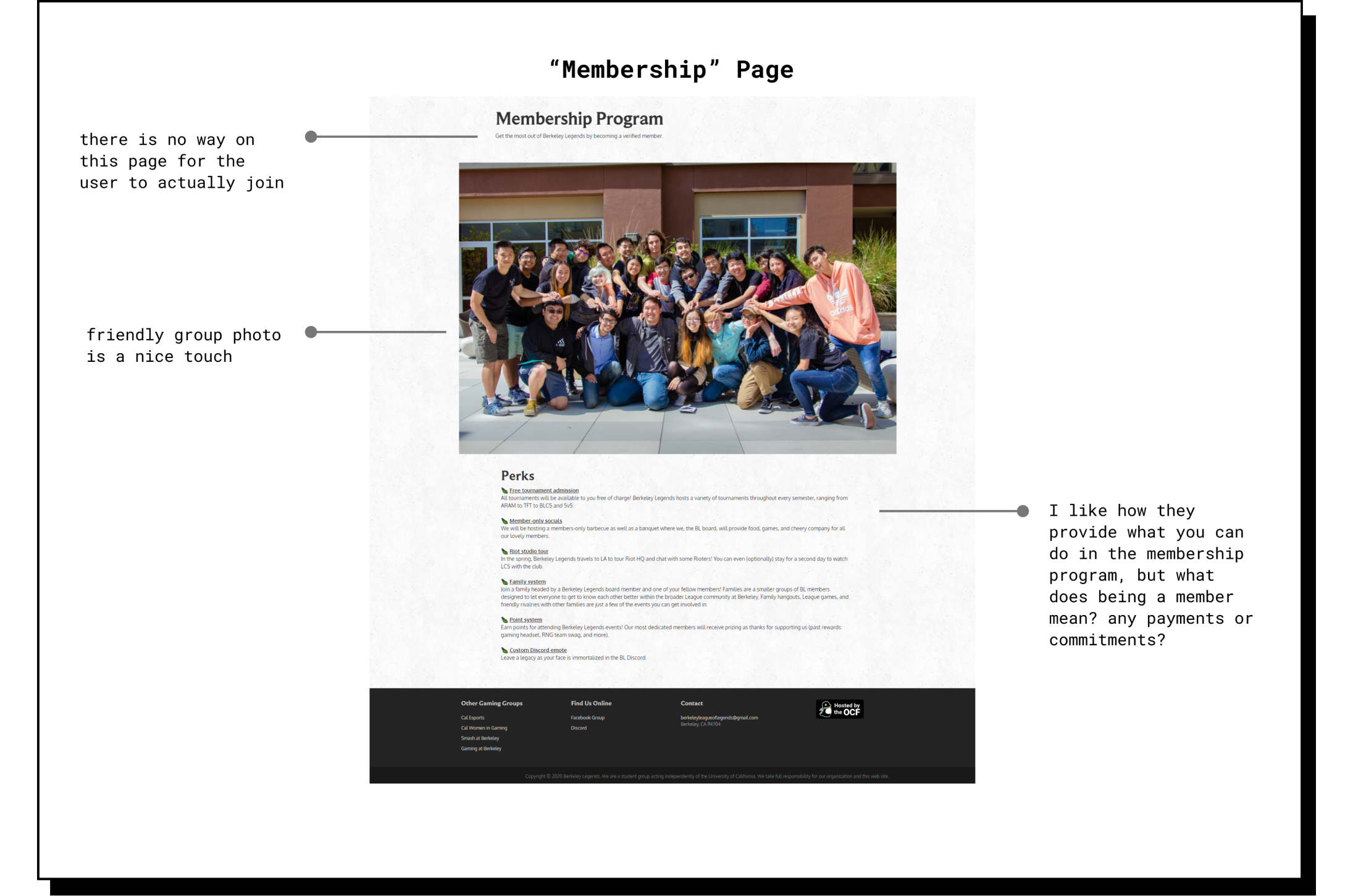
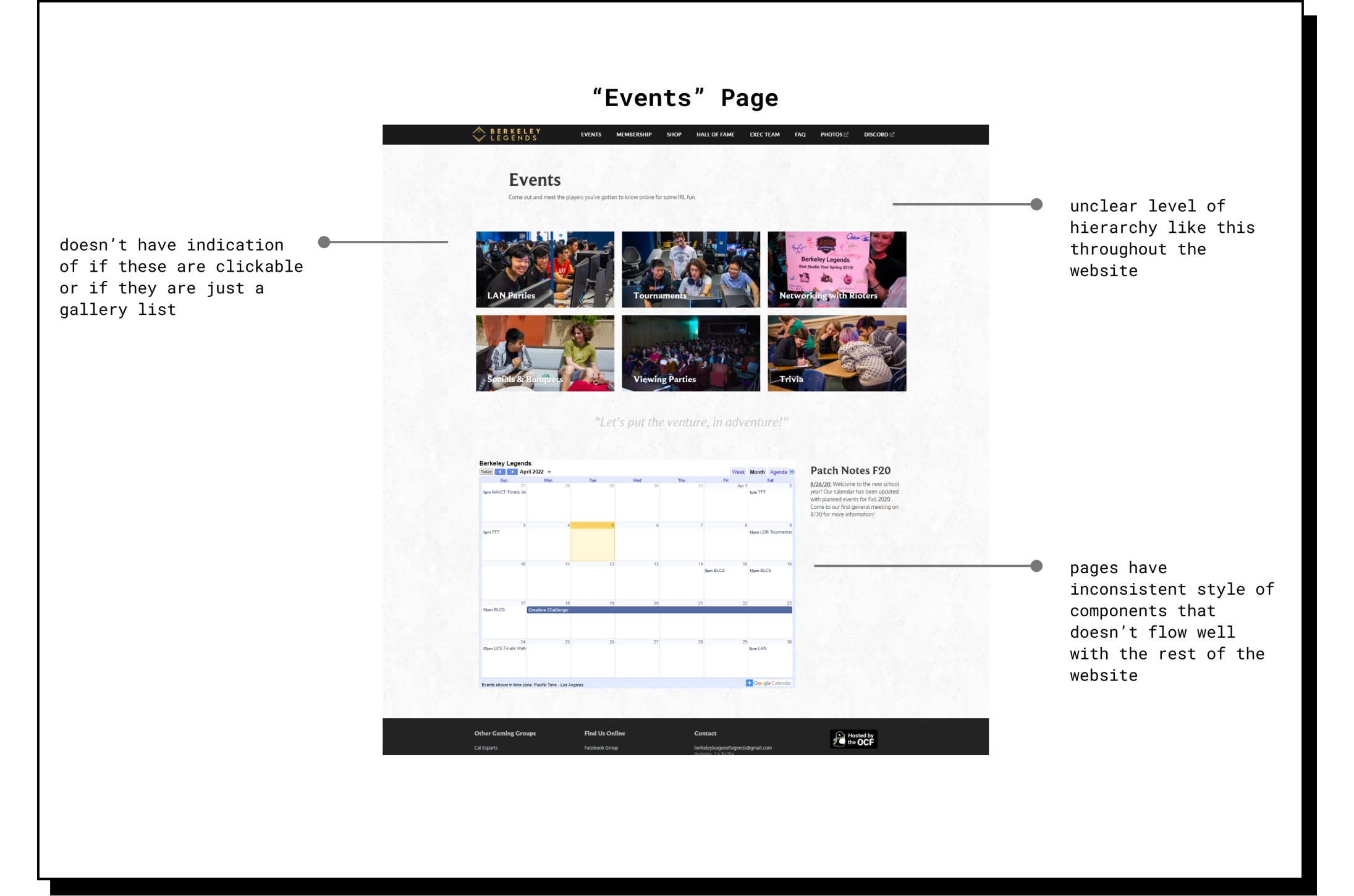
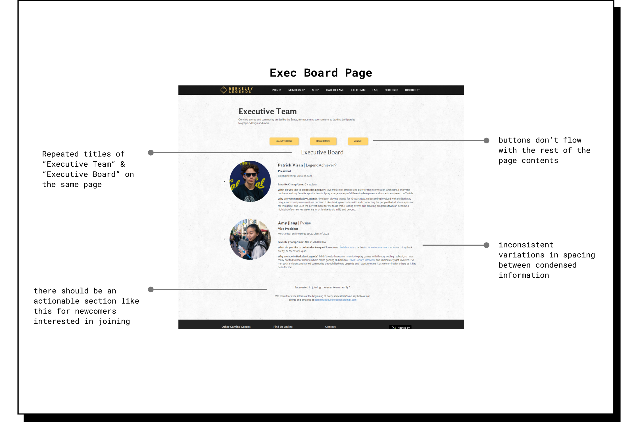
After getting survey responses from current club members and interviewing representatives from Berkeley Legends, we found that their current website was, at times, confusing to navigate for those who were unfamiliar with the organization, and it also didn’t fully reflect their active community.
They had many parts to their club (how to join, etc.) that was not clearly conveyed in their current website.
Style Guide.
My team was provided with the style guide of the club rebrand to guide future iterations.

Moodboard.
We also established a more definitive and stylistic summary for the new website with visual aids.

02 DEFINE
Design Direction: Welcoming, Friendly, & Exciting.
My team began to synthesize our insights, as well as organize our tasks based on the level of priority and amount of time needed for each feature/page. We also structured a design direction that would *direct* the course of our fidelities.
Business Goal:
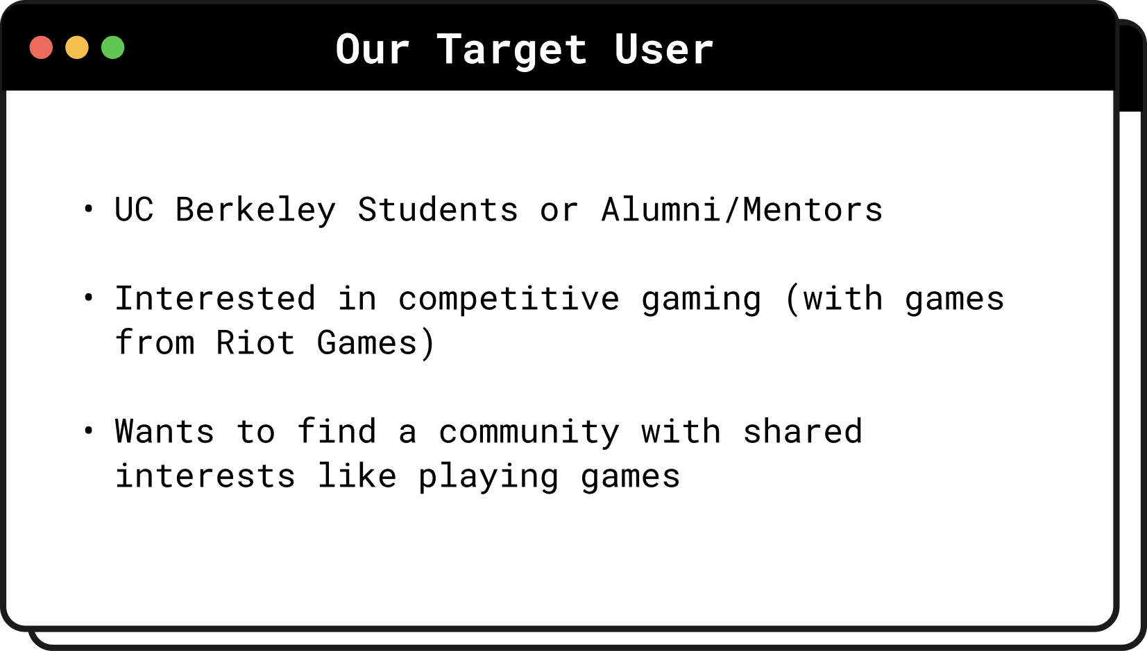
We wanted to ensure that the new website accurately reflects the club’s rebranding and facilitates the process of gaining new members.
User Goal:
Our main focus was for the website to be more easily digestible for newcomers - optimizing usability with smoother navigation throughout the website.
Problem Statement.
Gathering all of our presented and sourced resources so far, we started to lean towards the goal of facilitating the discovery of Berkeley Legends. Those who are already interested in joining might be more motivated to dig through the website over someone who was simply curious and undecided about joining.
So…
HOW MIGHT WE make Berkeley Legends easier to navigate and more enjoyable for newcomers?
03 DEVELOP
Iterations & Improvements.
Working with 2 other designers on my team, we each iterated on our ideas and convened during our weekly stand-ups to collaborate further.
After reorganizing the information architecture of the website, I explored low-fidelity layouts, created mid-fidelity wireframes, and then developed high-fidelity screens, as well as implementing major improvements along the way.
Reorganizing the Information Architecture.

The old organization of the website made it confusing for new users to find what they were looking for, so we adjust the pages shown on the navigation bar and the information displayed on each page.
Some Low-Fidelity Layout Explorations.

In this stage, we explored multiple ways to design our layouts. Examples include explorations with how we should display the “games we represent” section to highlight their top played games but also indicate more possibilities.
Mid-Fidelity Wireframes.

Development Constraints.
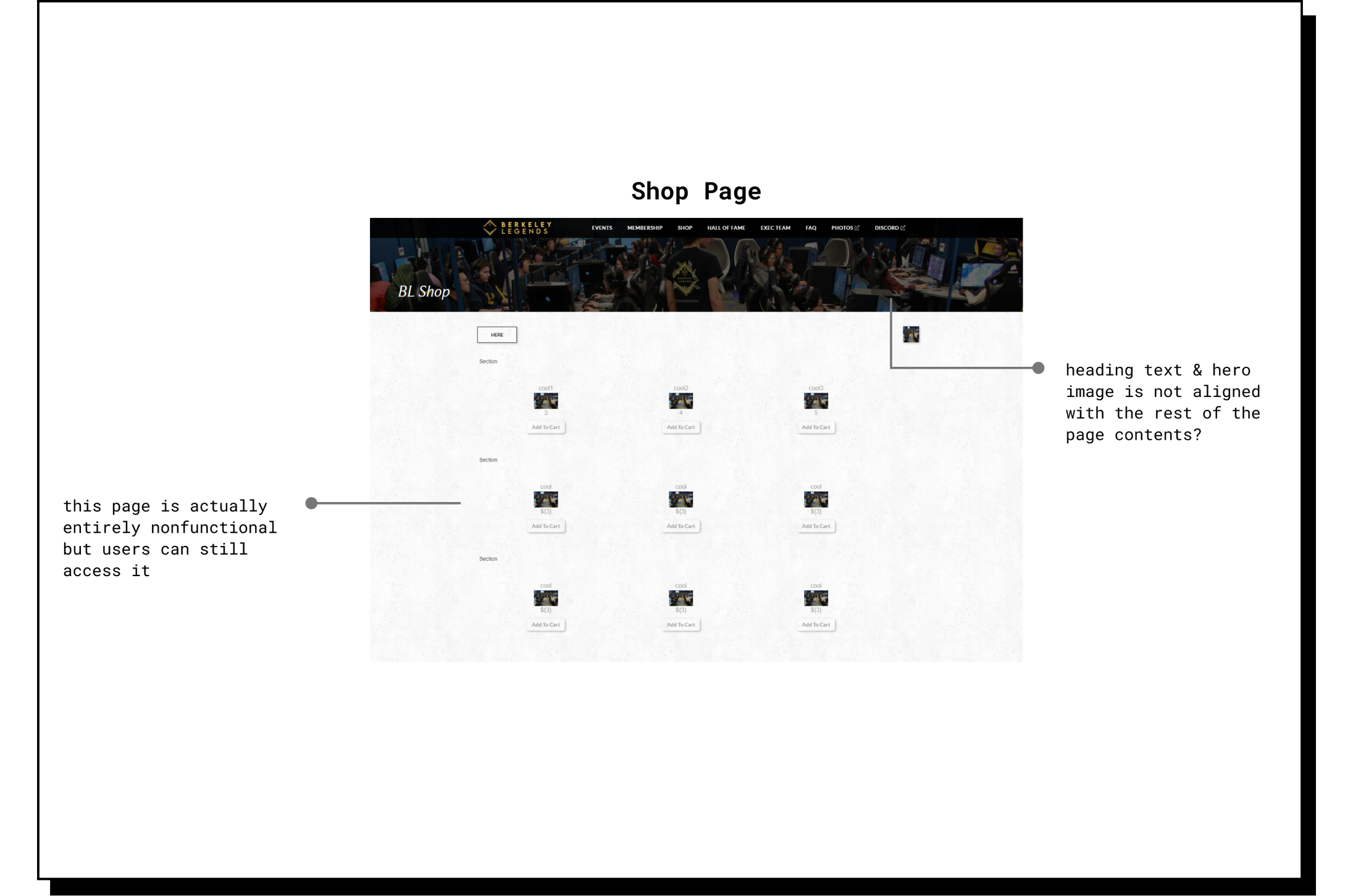
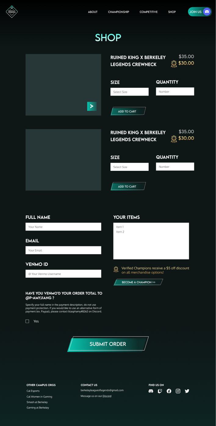
When designing the Shop Page, iterated on a few designs in collaboration with our team. We first designed Iteration 01, but our developers suggested an idea for Iteration 02 that they communicated would be more feasible. After compromising, we made the tradeoffs to continue with Iteration 03 based on the reported feasibility of development and amount of the time we had left.
Iteration 01
Iteration 02

Iteration 03

Major Improvements After User Feedback.
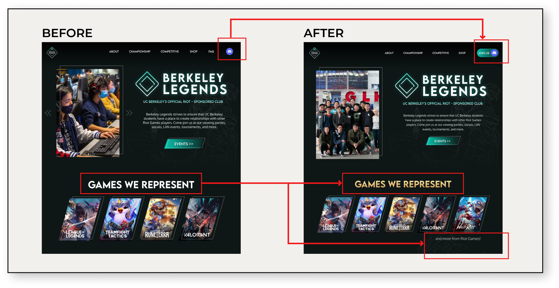
Change 01
Added a “Join Us” message to the Discord icon in the navigation bar in order to be more clear to users that may be unfamiliar with the platform about what the icon leads to.
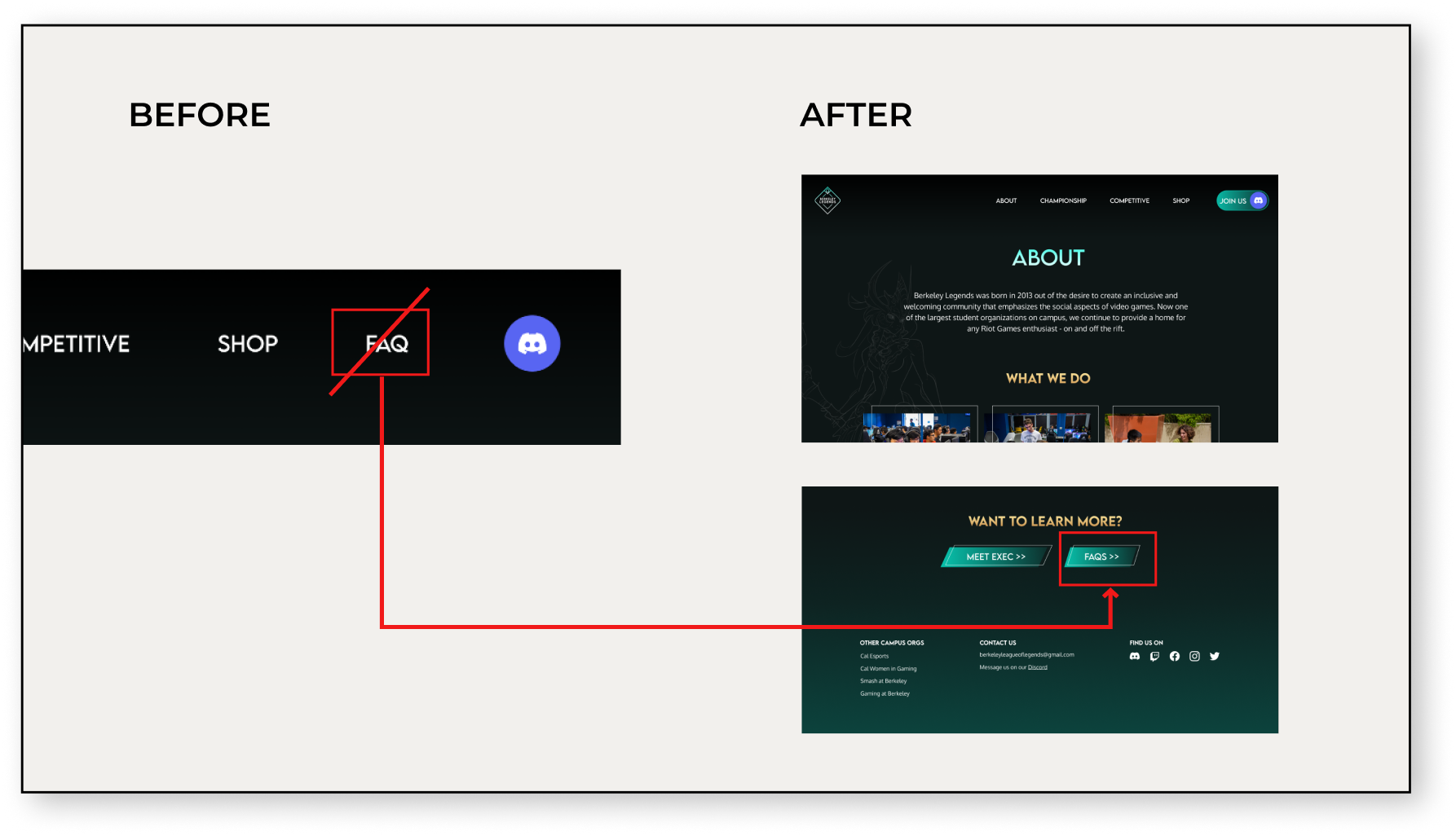
Change 02
Took out the FAQ link on the top navigation bar and added it at the end of the About page after we saw during user tests that the FAQ page was visited the most after seeing the About page.

Change 03
Added call-to-action buttons after descriptions in Home page for an easier user flow if they are interested to learn more about an aspect of the club.
FINAL RESULT

Home/Landing Page

About Page

Championship Page
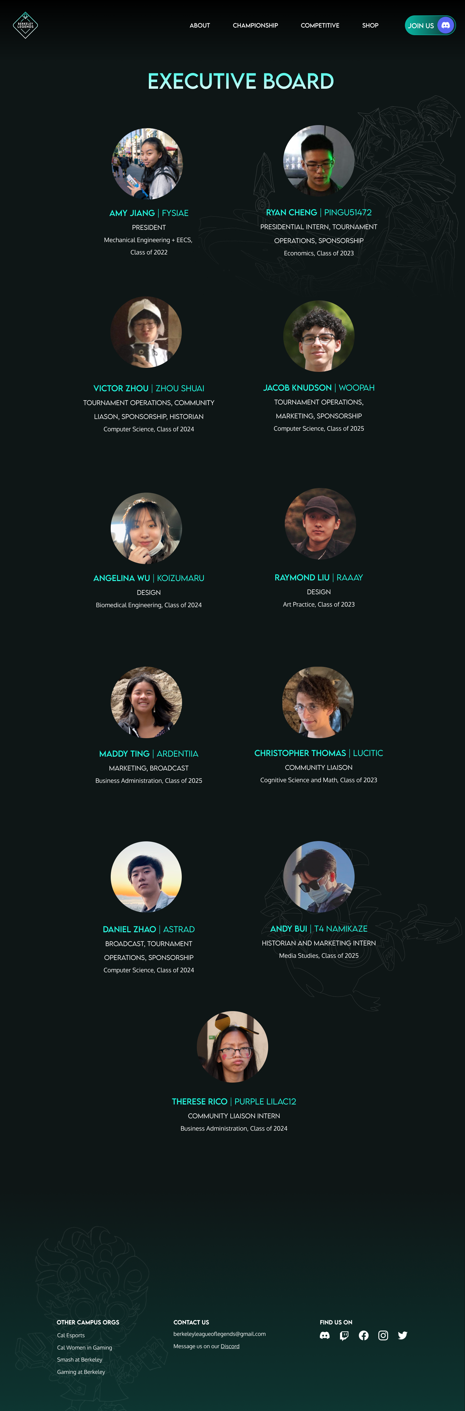
Exec Board Page
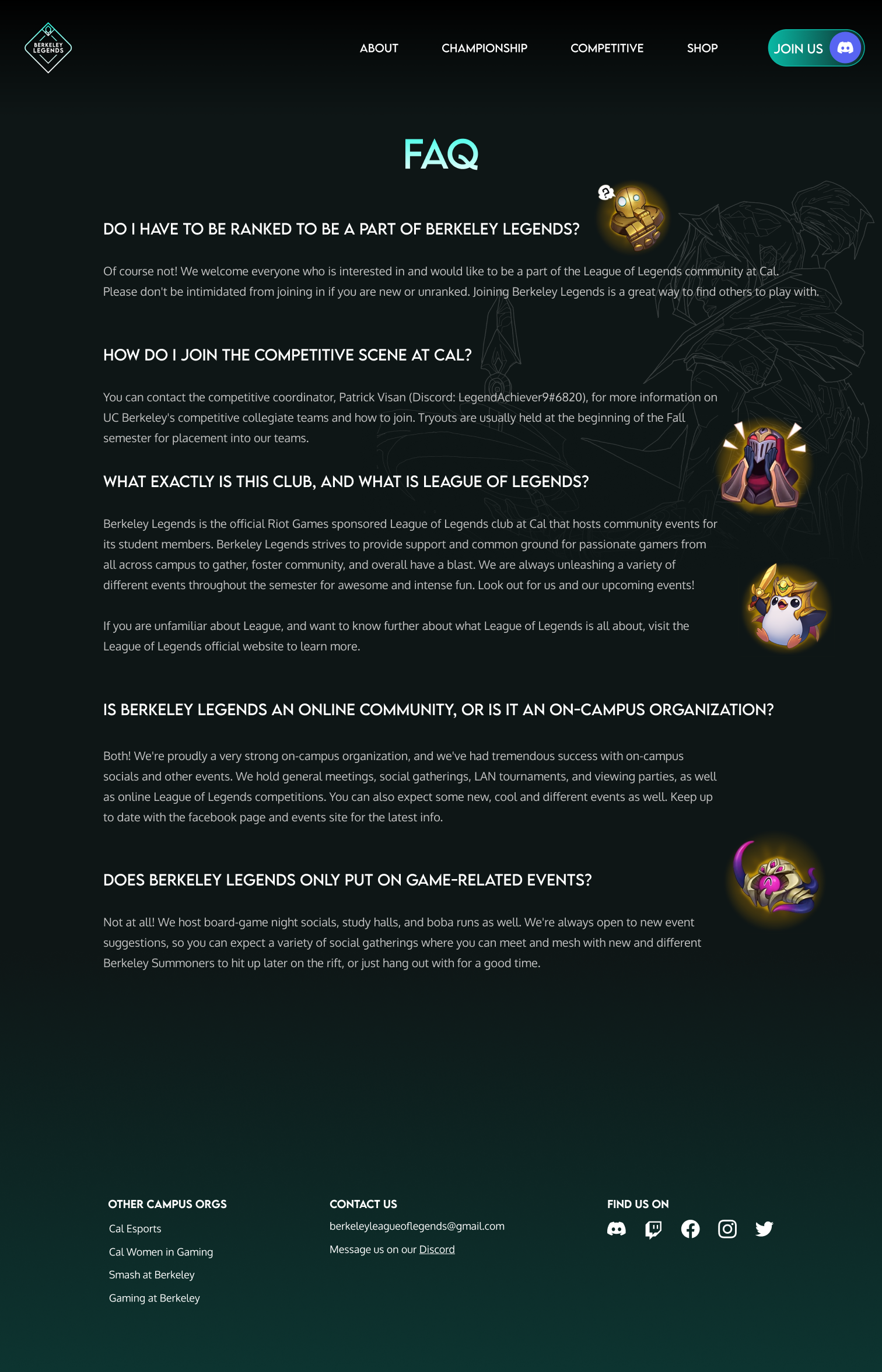
FAQ Page

Shop Page (no items)
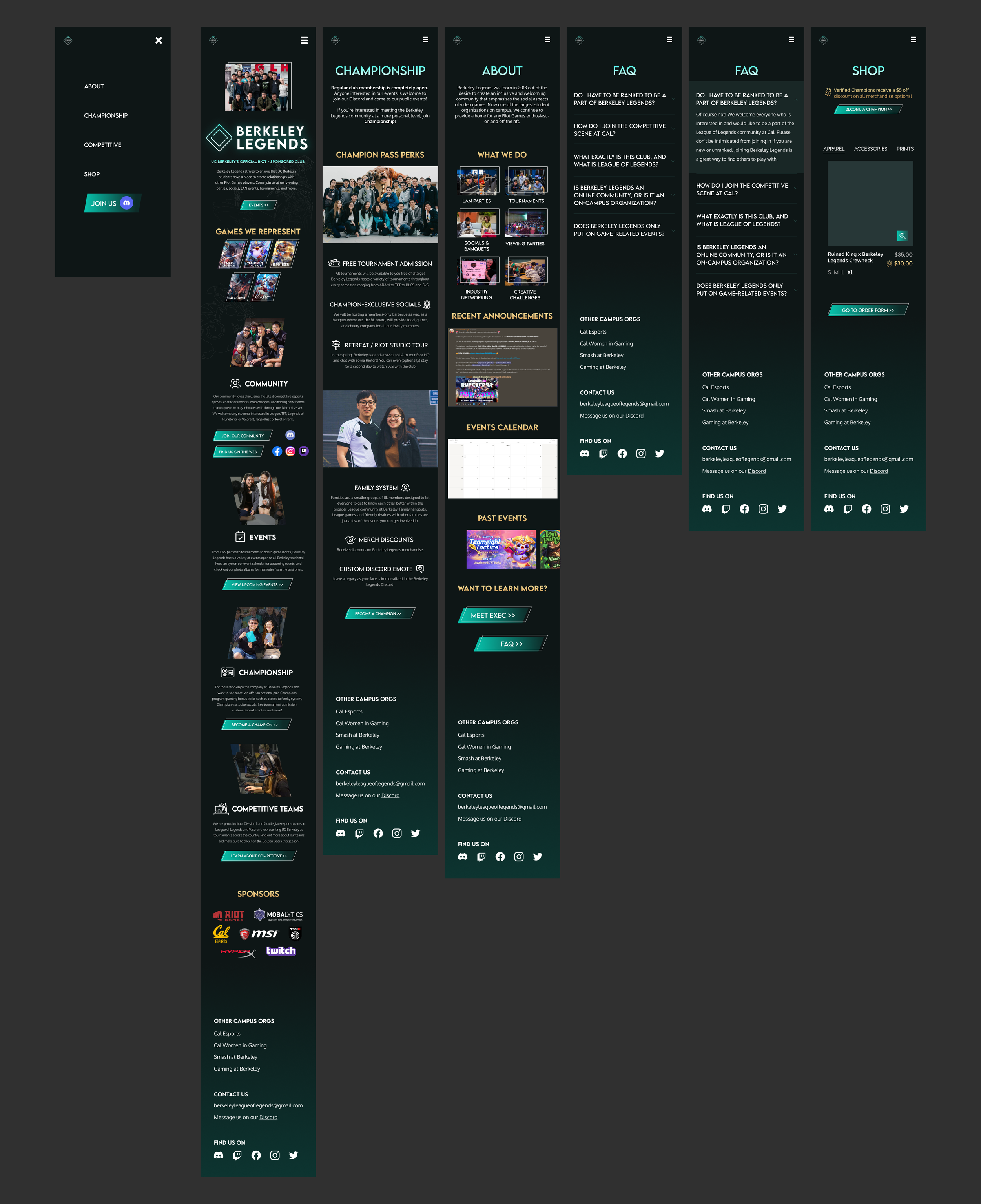
Mobile Screens
REFLECTION & TAKEAWAYS

I’m so thankful for this opportunity and all the friends I made while working on this project! I learned so much about how a digital product really comes to life and about communicating with a team outside of design.
01 Introduce my designs early.
Even a “finished design” always has improvements/changes that can be made, and by letting the team in early on any of my designs makes the iteration process smoother.
02 Understanding the Constraints.
Working with a cross-functional team made me realize that the perfect UX process is ideal, but in reality, I don’t get to apply everything I’ve learned in a project. Making design decisions involved much more than just a relationship between me and a user, but also stakeholder negotiation/priorities, development constraints, and more.